Creative Challenge - Recreate a "Go By"
Full-transparency, I did not come up with this awesome self-educational tool on my own. This was actually a project Justin Clemons encouraged our THAT PHOTO SCHOOL group to do.
I don’t know why, but I was procrastinating hard-core on this one. Well…
…I kind of know why.
One, that whack @$$ winter storm that rolled through Texas put me in a funk.
Two, you guys ever think about doing something, and the project or task as a whole feels so overwhelming it makes you too lazy or anxious to start? You completely forget that lesson you were supposed to learn from that proverb, “Every journey begins with a single step”; and that single step in this scenario was SUCH an easy one: find a photo to recreate. What’s more, I already have a folder full of images from photographers I admire. So EASY! And yet here we are, three weeks later. I’m literally only now starting because as I am typing this post on Feb. 20th, critique is just three days away.
Anyway, here is the go by I decided to recreate!

Photographer: RJ Muna
My next step was to dissect the photo! I felt like a bloody detective!! But like …significantly less cool, and less helpful to society. I spent some time piecing together my best guess at a lighting diagram, and writing out how I got there. Putting pen to paper helps me digest things, ‘cause it forces me to slow down and think methodically. It also etches the knowledge into my brain for future reference. In fact, as I was writing this post, it forced me to reassess a few things, and I ended up changing my diagram
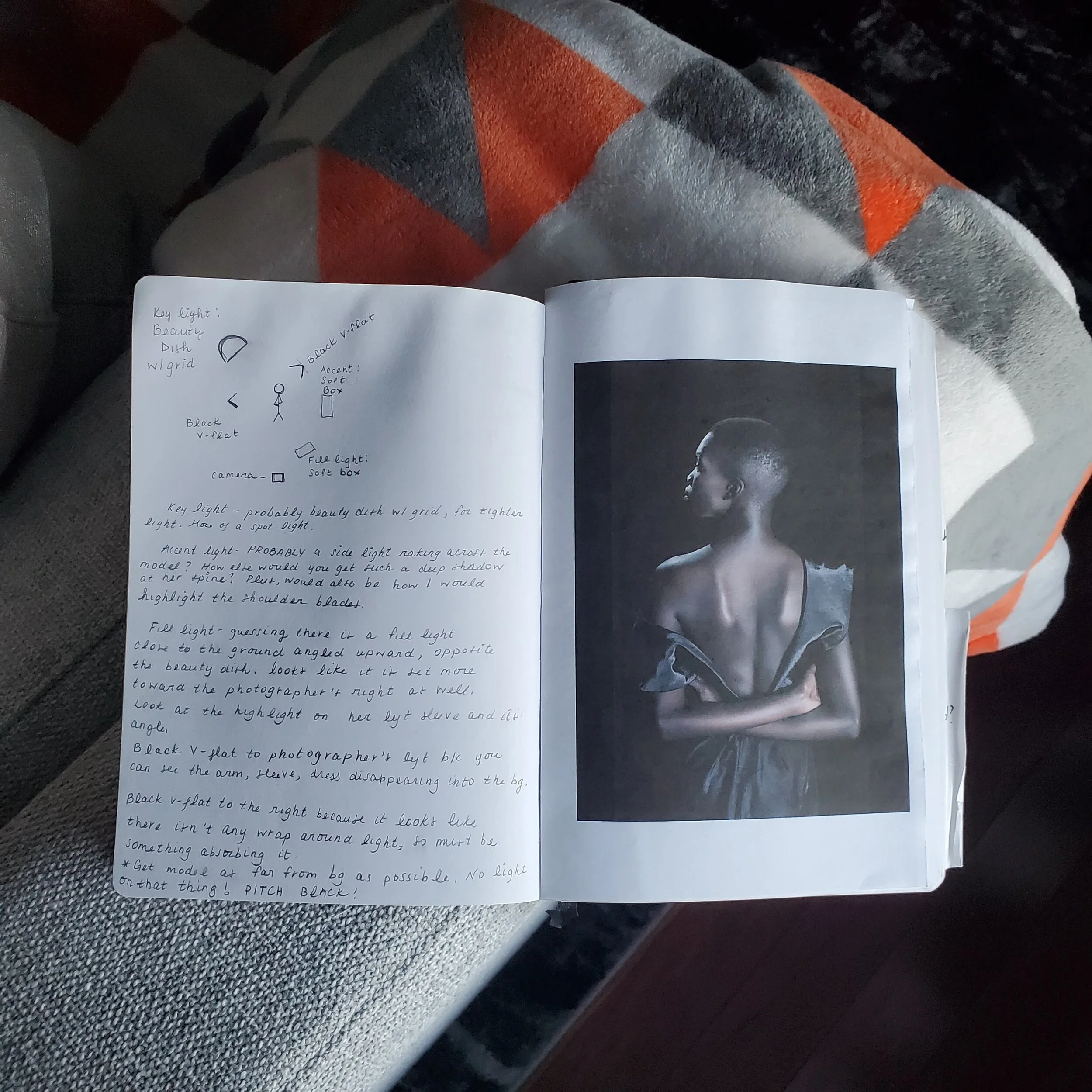
My lighting diagram and notes.
Now, if you’re into the technical stuff, read on, ‘cause I’m about to walk you through my notes; but if that sounds boring as hell, please feel free to skip to the bottom of the page to see a side-by-side of the inspiration and my final portraits!

Key Light
Key Light
My guess, they’re using a beauty dish to highlight the profile of her face, and shoulder. I’m also assuming:
1) There isn’t a diffuser, because it’s a hard light.
2) There is a grid. A grid is something you can use to concentrate your light. It allows you to light your subject, creating more of a spotlight, by keeping the light from spreading to your backdrop, and other parts of the body.
I also used the shadow from her nose to figure out what direction the light was coming from. It’s taller than her, coming downward, and closer to the backdrop than the subject, pointing slightly toward the camera.

Accent Light & Fill Light
Accent Light
There was definitely a light to her right based on the shadow I circled in red, as well as the highlight on her arm I bracketed in white above. I also figured it was a side light, because of the “textures” you can see on her back, i.e. her shoulder blades, and her spine.
Note: Using side light is a GREAT way to bring out textures, whether it’s the fluffiness of a sweater, the bark of a tree, or the sand in the pavement!
Fill Light
I was also thinking there was a fill light, set slightly lower, creating that shadow above her left arm I circled in blue! That the top of her head isn’t completely lit also made me think the fill light was set a bit lower: note the blue bracket. The fill is super soft though, just barely filling in some of those shadows that would have been on her back due to that side light!
V-Flats | Quad Folds
Last but not least, I assumed there were two black cards on each side of her absorbing light. One directly to her left causing her left arm to begin disappearing into the backdrop, and one on the right, probably further in front of her, possibly at a 45 degree angle.
So those were all my initial thoughts, which I used as a starting point. After actually doing the shoot, here’s my:
1) Side-by-side
2) Final Lighting Diagram
3) Add’l shots
Cheers!

An ALMOST perfect match. Didn’t get the fill!

I took down my beauty dish before I remembered to snap this photo. facepalm

An aerial view.


Per my model’s request, a flex option. :)